 a Histogram in Microsoft Excel")
If you need to create a graph that shows frequency distributions, you will want to make a histogram. This type of chart can show how often various data occurs and can help you analyze process changes. A histogram is often used as a quality control tool, but it can be beneficial to many industries.
Here we will explain how to create a histogram in Microsoft Excel. And to make your histogram more useful or attractive, we will also show you how to customize it.
How to Create a Histogram in Excel
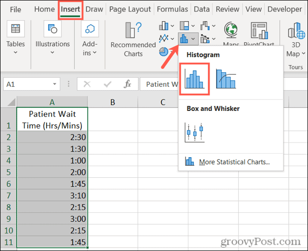
Inserting a chart in Excel is actually quite easy. Assuming you have your data ready to go, select it. Next, go to the tab Insert, click the arrow Insert Statistics Chart and choose Histogram (on the left).
The graph will appear on your spreadsheet. It contains a default style, and the intervals are automatically set based on your data. But this is where chart customization comes in.
How to Customize a Histogram in Excel
There are two main parts to customizing your histogram in Excel, usage and appearance. Starting with the most important, let’s see how to set your chart intervals to make it more beneficial.
Set up a histogram
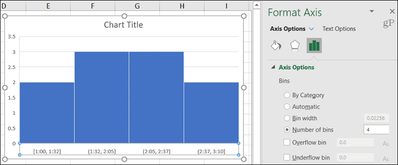
The columns that you see in your histogram are called Bins. These are used to show the distribution of the data – how often the values are applied to the ranges. The bins are the same width, but the height is equal to the number of data points for each bin.
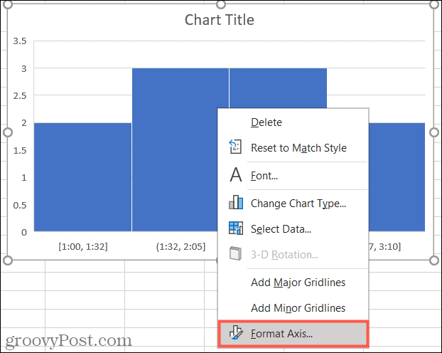
To open the interval formatting options, right-click the horizontal axis of the graph and select Format axisor double-click the axis.
When the sidebar opens, expand the Shaft options. You can then adjust the following settings:
- By category: If your data uses text instead of numbers, you can select this option. The histogram groups the categories and adds the values.
- Automatic: This is the default setting for histograms in Excel, which automatically calculates and assigns the number of containers.
- Range width: You can change the width of the intervals (columns) by entering a decimal number in this section.
- Number of ranges: Here you can enter the exact number of containers you want to use if it is different from the result of the automatic configuration.
- Overflow range: Use this tray for values greater than a decimal number that you enter in the box to the right.
- Underflow range: Use this tray for values less than or equal to a decimal number that you enter in the box to the right.
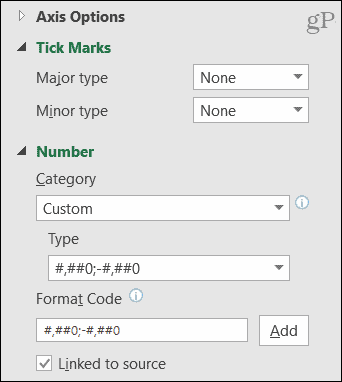
Under Axis Options in the sidebar, you can also expand Graduation marks and Number to adjust the chart points, category, and format code.
Adjust the appearance of a histogram
If you want to change the appearance of the histogram, the chart elements, and the title, you have many formatting options.
In the tab Design of the chart, you can add or remove elements of the chart or change the style. But you can also select a new layout, adjust the data selection, or move the chart to another location.

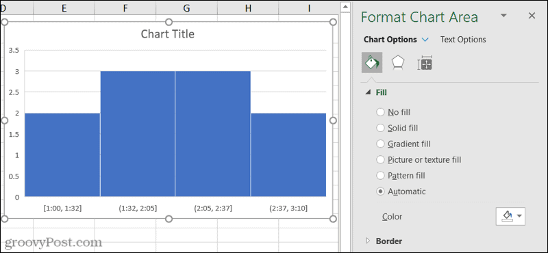
In the sidebar of Chart area format, you can choose fill and line colors and styles, apply a shadow or 3D format, and enter an exact size for the graphic or lock it. To open the sidebar, right-click on the chart and select Chart format or double click on the chart.
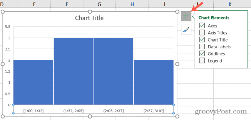
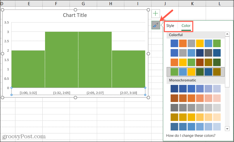
In Excel on Windows, you can show the buttons Chart Elements and Chart Styles to the right simply by selecting the graph.
- Chart elements: Check and uncheck those items you want to show on the chart. Select an item to choose its position on the chart.
- Graphics Styles: Use the Style and Color tabs to give your graphic a different look.
Other graphics options
Here are some additional options that you can customize for your histogram in Excel.
- Move the chart: Click and drag the chart where you want it on your sheet.
- Resize the chart: Click on a corner or edge and then drag in or out to resize it.
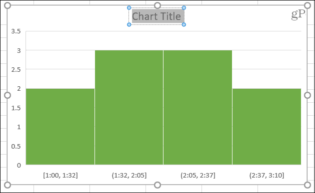
- Enter a title for the chart: Click the Chart Title text box on the chart and enter a title.
Show your frequency data in a histogram in Excel
Since it is so easy to create a histogram in Excel, consider it for your frequency data. The customization options are plentiful, and your audience might appreciate the visual utility.


