For a neat, clean way of displaying data that changes over time, consider a line chart. In Microsoft Excel, you can choose from different types of line charts and customize the chart to suit your taste or sheet style.
Whether it’s your support calls for the month, multi-week sales, or last year’s revenue, a line chart gives you a quick and clear overview.
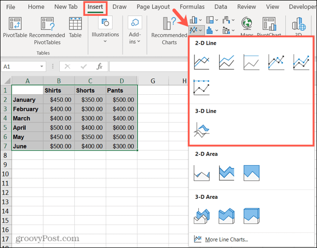
Types of Line Charts in Excel
Open your spreadsheet in Microsoft Excel and consider which type of chart best fits your data.
Line graph: A basic line chart for displaying multiple data points and when category order is key.
Stacked line charts: Line graphs showing the changes over time of parts of an assembly.
100% stacked: Similar to stacking, but shows the percentage contribution of the parts of the whole.
Line charts with markers: A line chart with markers for horizontal access. These show fewer data points better than basic line charts.
3D line chart: Includes a third axis to place lines in front of each other to achieve a three-dimensional appearance.
If you’re not sure which type of line chart is right for your data, continue with the steps below to preview each one.
How to Create a Line Chart in Excel
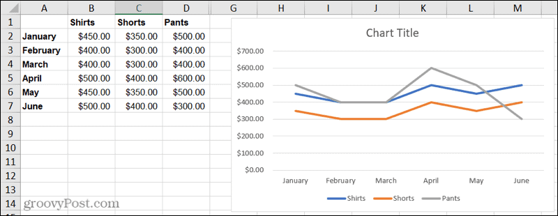
With the data ready, it’s time to create the line chart. For example, we will display product sales over a six-month period on a basic two-dimensional line chart.
- Select the data you want to display on the chart and go to the tab Insert.
- Click the drop down arrow Insert line or area chart.
- Choose the type of line chart you want to use. In Windows, you can hover over each type of chart to see a preview. This can also help you determine the most appropriate type.
When you select the line chart you want to use, it will appear on your sheet. From there, you can adjust the appearance and elements of the chart.
How to Customize a Line Chart in Excel
Microsoft Excel offers a variety of customization options for your charts. And you have a few methods to make your changes.
Chart Layout tab: Select the chart and then click the tab Design chart. With it, you’ll see tools on the ribbon to choose a different layout, choose a style or color scheme, select data, and change the type of chart.
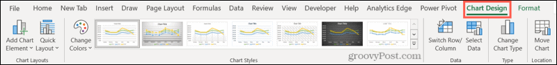
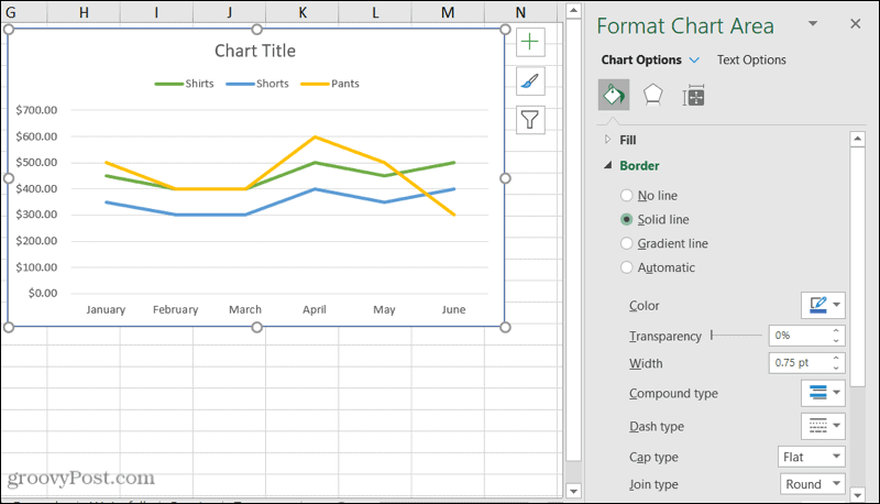
Chart Area Format sidebar: Double-click on the chart to open the sidebar of Chart Area Format. Then use the three tabs at the top for Fill and Line, Effects and Size and Properties. You can then adjust the fill and border styles and colors, add a shadow or reflection, and resize the graphic using exact measurements.
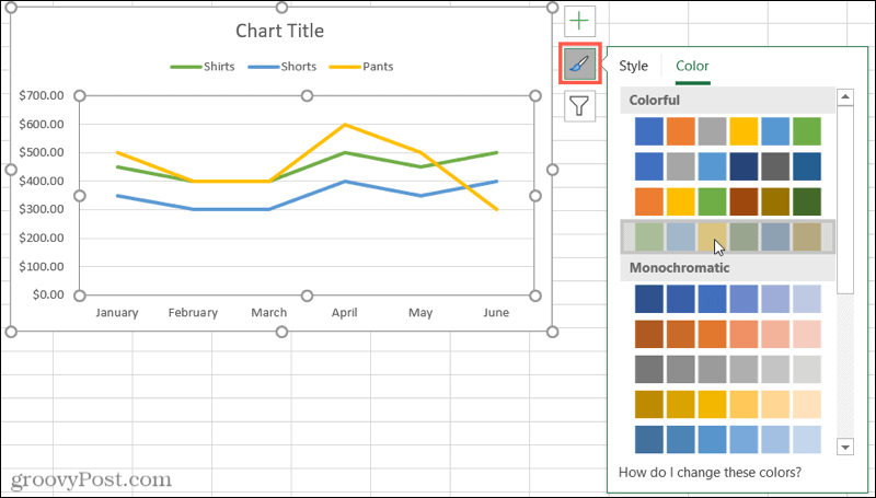
Windows tools: If you’re using Excel on Windows, you’ll see three handy buttons appear to the right of your chart when you select it.
- Chart elements: Add, remove, and reposition your chart elements, such as legend, labels, and grid lines.
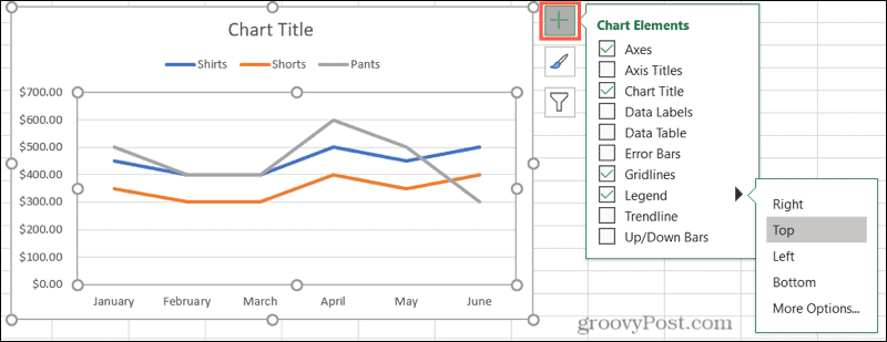
- Graphics Styles: Choose a different style for your graphic or select a color scheme.
- Chart filters: Highlight specific data from your dataset using the check boxes.

Additional chart options
To move the chart, select and drag it to a new place on the spreadsheet.
To resize your graphic, click and drag in or out from a corner or edge.
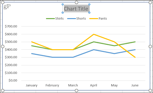
To give the chart a title, click the Chart title text box and enter the new title.
Try a useful line chart to show your data
Charts are very useful visuals that allow you to easily spot patterns, see similarities and differences, and get a great, high-level view of your data at a glance. If you want to show data trends or data over a period of time, create a line chart in Excel.


